Sam Hart
Data visualization developer
I'm a journalist who codes and designs. I currently work as a data visualization developer at Reuters Graphics. Scroll to see some of my work 👇
Highlights
Some projects I’ve done recently:
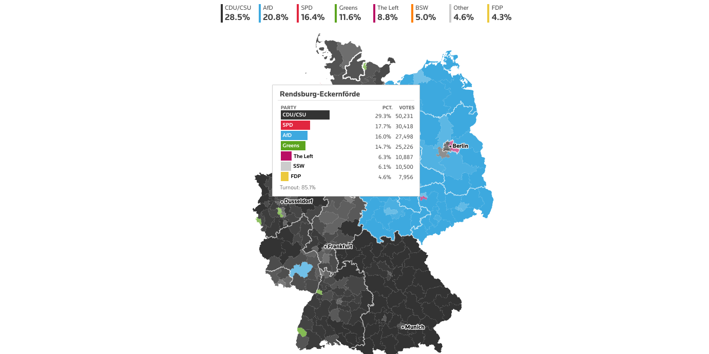
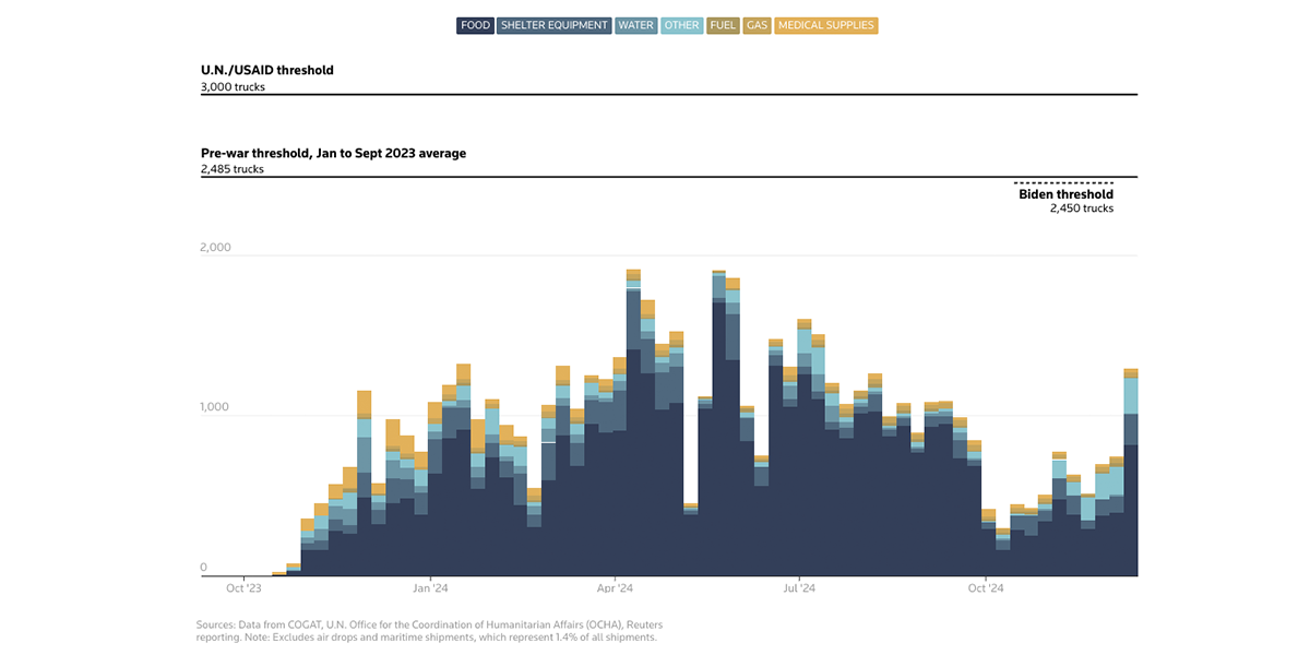
Germany’s national election: Results
Here I made a simple choropleth map and a bar chart on a tooltip – some classic data viz on Germany’s election night.
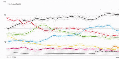
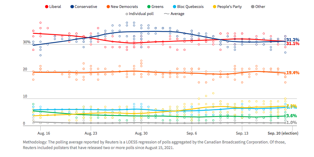
Germany’s national election: Polls
This simple poll chart was a major back end exercise: I also created the scraper that pulled polling results from Germany’s federal website and fed them into this chart, which updated multiple times daily leading into the Feb. 23 election.
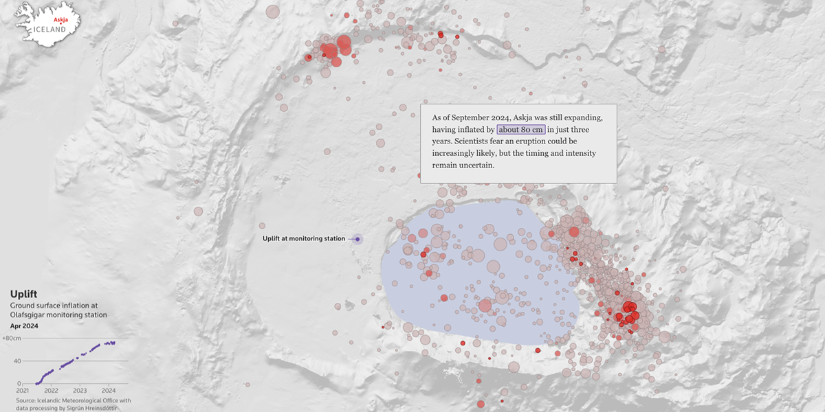
Volcanoes and climate change
This Reuters special report highlights research suggesting that melting glaciers could be contributing to an uptick in volcanic activity.
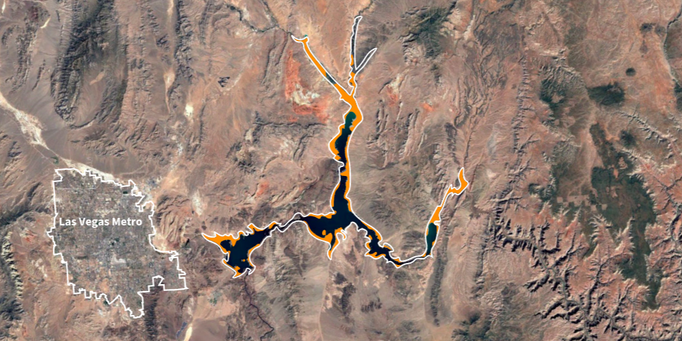
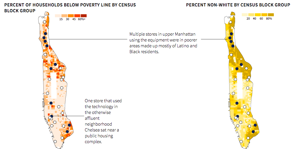
A public health agency became a shield for polluters
An investigation highlighting how a public health agency’s faulty reports allow large companies to save money on cleanup. For this one, I made the satellite scroll walkthrough.
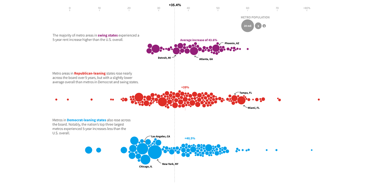
Housing costs in swing states
Used a few beeswarms here to show how high housing costs affected metro areas in key swing states ahead of the November election.

Christmas music, analyzed
A thorough analysis on why we listen to the songs we do when Christmas rolls around. Come for the fun illustrations (the work of a talented colleague), stay for a Christmas-light inspired Billboard chart and a hierarchical snowflake viz.
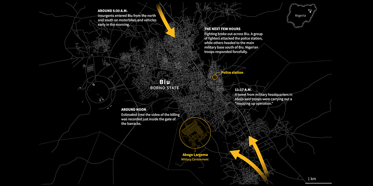
An execution by the Nigerian military
This video analysis collaboration with Bellingcat, a European investigative journalism unit, required sensitive graphical treatment. For the project, I created a map showing the movement of Nigerian insurgents into the town of Biu and an audio player that pinpointed the moments gunshots erupted. Warning: some of the images and videos in the piece are very graphic.

Box office breakup
Hot off the 2022 election, I did a quick R analysis to determine: is the romantic comedy a lost genre? This was a satisfying turn from R to a linear sveltekit narrative: I wrote, reported, collaborated with our illustrator and built the graphics you see here.

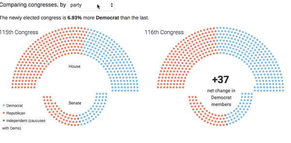
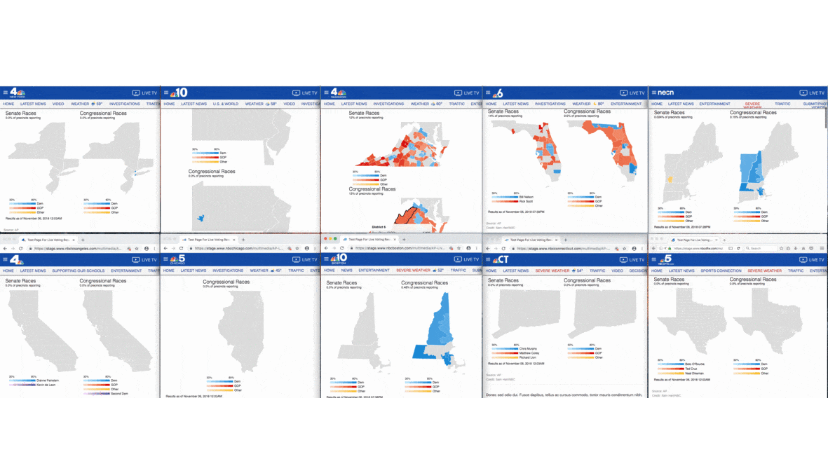
2022 Midterm elections
I served as a front-end developer on Reuters’ election rig. Aside from the page available on reuters.com, the project includes translations into over 10 languages and dozens of embeds provided to clients to mix, match and implement on their own websites.
Abortion clinic access
My first project truly fueled by an R analysis, this one involves calculating distances and joining Census data for a satisfying quick-turn.
Anatomy of a death threat
A collaboration with our Special Reports team, I helped with the final piece in their series on threats to election workers by designing and building this page.
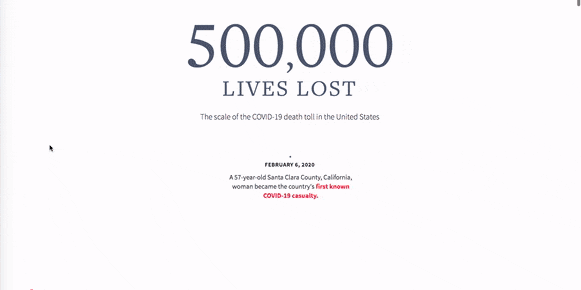
500,000 lives lost
The goal for this somber COVID-19 benchmark for the U.S. was to lay out the scale of 500,000 deaths without compromising on the humanity of the situation. I harnessed the power of Canvas and IntersectionObserver to load 500,000 dots on this page, and was mostly satisfied with the outcome.
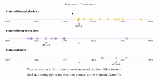
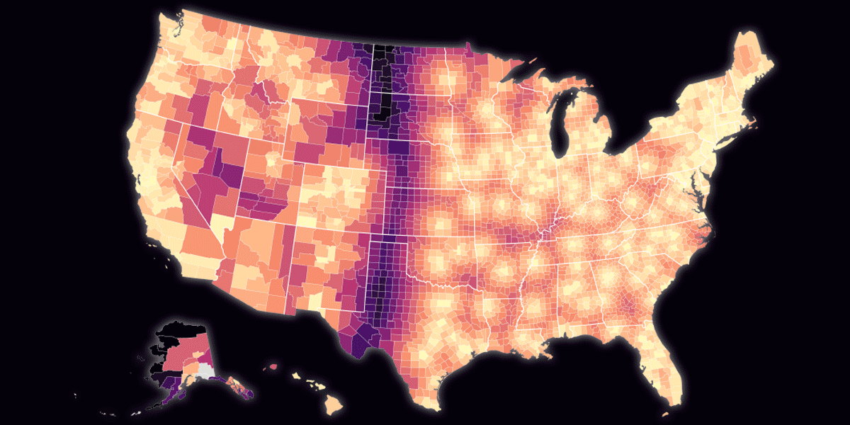
A wave of voting laws
An example of a quicker hit on deadline, I made use of our team tooling and customized our cartogram to fit the needs of this voting policy project. This one went up in less than a work week.
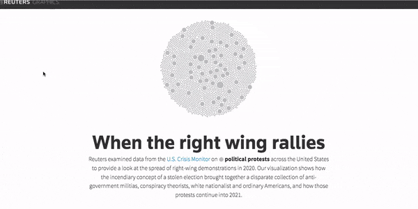
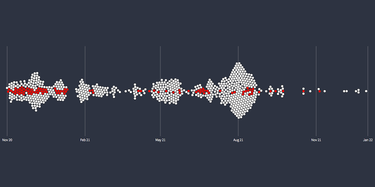
When the right wing rallies
This post analysis of the Jan. 6 Capitol riots uses animation and d3-force to visualize data from ACLED.
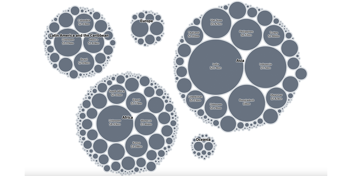
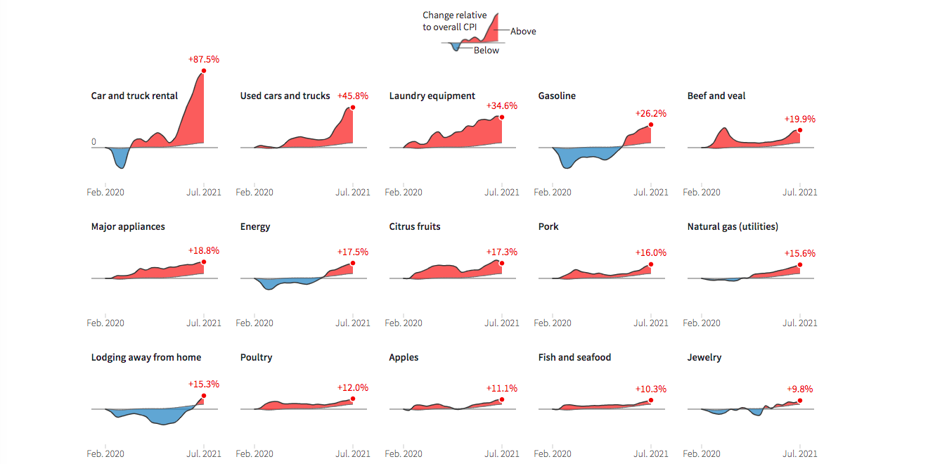
The archives
Some more clips, from the archives: